


The Psychology of Warm Colors in Home Decor
 January 23, 2026
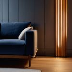
I still remember the first time I restored a vintage armchair, Napoleon, and how its warm, earthy tones seemed to invite conversation and comfort. As I delved deeper into the world of interior design, I began to appreciate the psychology of warm colors and their impact on our emotional well-being. It’s fascinating to see how these hues can evoke feelings of coziness and relaxation, much like the sensation of sitting by a crackling fireplace on a chilly evening. However, I’ve often found that the discussion around warm colors can be overly complicated, with some designers insisting that only specific shades can achieve the desired effect.
As someone who’s passionate about creating spaces that tell a story, I want to cut through the noise and share my honest, experience-based advice on how to harness the power of warm colors in your home. In this article, I’ll explore the ways in which warm neutrals and rich earth tones can be used to create inviting, meaningful spaces that reflect your personality and style. I’ll draw from my own experiences restoring vintage furniture pieces, like Marie Antoinette, a beautifully crafted dresser with a warm, honey-colored finish. My goal is to provide you with practical, no-nonsense guidance on how to incorporate warm colors into your design, without breaking the bank or sacrificing your personal taste.
Table of Contents
Unveiling Warmth
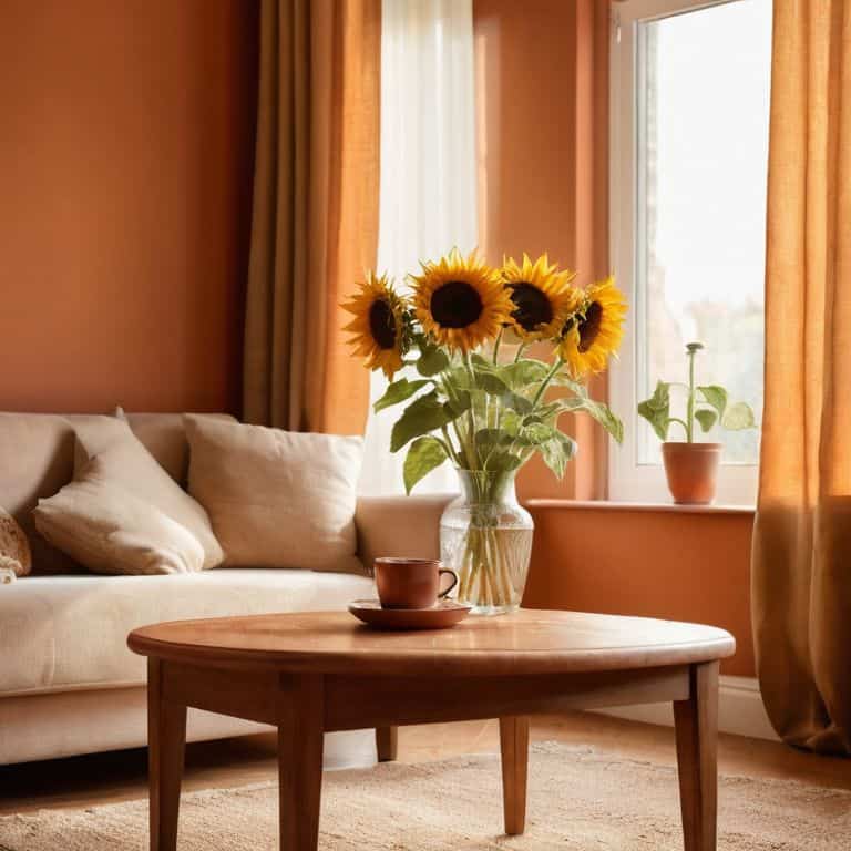
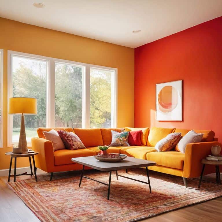
As I delve into the world of warm colors, I find myself drawn to the emotional impact of orange hues. There’s something about the way orange can evoke feelings of nostalgia and comfort, much like the sensation of walking into a cozy, vintage-inspired living room. The warm glow of orange-toned wood and the soft, golden light that spills from table lamps can transport us back to a bygone era, one of simplicity and elegance. I recall restoring a vintage armchair, which I later named Marie, after the infamous Marie Antoinette, and how the orange undertones in its upholstery seemed to bring out the richness of the wood.
In my experience, red color stimulation effects can be quite profound, especially when used in moderation. A bold, red accent wall can add a touch of sophistication to an otherwise minimalist room, while a subtle, red-patterned rug can introduce a sense of warmth and energy. As I work with clients to create their ideal spaces, I often find that incorporating warm colors can have a profound impact on the overall ambiance, making a room feel more inviting and cozy. The right balance of warm colors can also influence the yellow color in marketing psychology, as it can stimulate feelings of happiness and optimism.
When it comes to warm colors in interior design, I believe that cultural associations play a significant role. Different cultures have unique relationships with warm colors, and understanding these associations can help me create spaces that resonate with my clients on a deeper level. By thoughtfully incorporating warm colors into a room’s design, I aim to craft an atmosphere that not only reflects my client’s personality but also tells a story of its own, one that is both nostalgic and forward-thinking, much like the warm color palette in branding that I often draw inspiration from.
Embers of the Past Orange Hues
As I delve into the realm of warm colors, I find myself particularly drawn to the vibrant orange hues that seem to dance across the surfaces of vintage furniture. There’s something undeniably captivating about the way these tones can evoke a sense of nostalgia, transporting us back to a bygone era.
In my own workshop, I’ve had the pleasure of restoring a beautiful armchair, which I’ve affectionately named “Vincent” after Van Gogh, and bathing it in a warm orange glow that seems to bring out the rich textures of the wood and upholstery.
Stimulating Spaces Red Color Effects
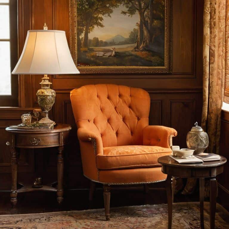
As I delve into the realm of red hues, I’m reminded of the vibrant energy they bring to a room. My grandfather’s workshop, where I spent countless hours restoring vintage furniture, was always filled with the warm glow of red oak and the rich tones of crimson-stained wood. This nostalgic connection draws me to the bold, statement pieces I’ve named after historical figures like Napoleon, whose fearless spirit is embodied in the fiery red of a meticulously restored armchair.
In my designs, I often use red accents to create cozy nooks, inviting spaces that envelop occupants in comfort and warmth. Whether it’s a plush, red-velvet sofa or a rustic, red-painted side table, these elements have a profound impact on the ambiance of a room, stirring conversations and fostering connections among those who inhabit the space.
Psychology of Warm Colors
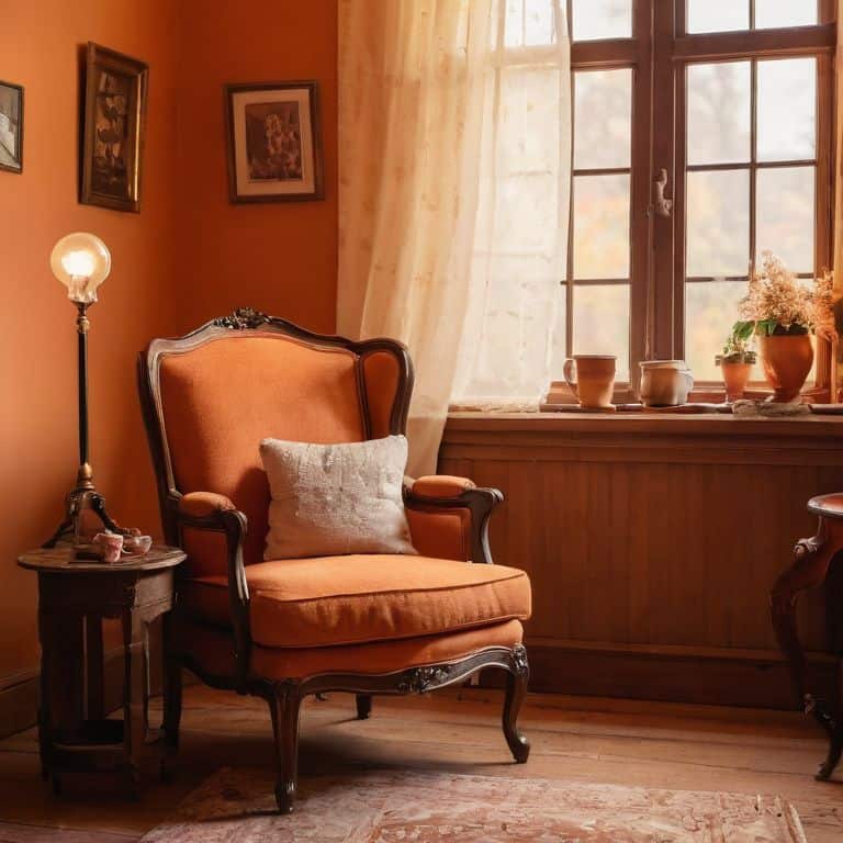
As I delve into the realm of warm colors, I find myself drawn to the emotional impact of orange hues, which evoke a sense of comfort and coziness. This is particularly evident in vintage interiors, where orange tones can add a touch of nostalgia and warmth. I recall restoring a vintage armchair, which I named “Vincent” after Van Gogh, and painting the walls a soft orange hue to complement its rich, wooden tones. The result was a stimulating space that seemed to transport all who entered it to a bygone era.
The use of warm colors in interior design is not just about aesthetics; it also has a profound effect on our mood and behavior. Red color stimulation effects, for instance, can increase energy levels and stimulate conversation, making it an ideal choice for social areas like living rooms and dining rooms. I’ve seen this firsthand in my own work, where a strategically placed red accent wall can completely transform the ambiance of a room.
In my experience, a well-crafted warm color palette can make all the difference in creating a welcoming and inviting atmosphere. By carefully balancing different shades and tones, I aim to craft spaces that not only look beautiful but also feel meaningful and timeless. Whether it’s the yellow color in marketing psychology or the cultural associations of warm colors, each element plays a crucial role in shaping the overall mood and character of a room.
Cultural Embers Warm Colors in Design
As I delve into the realm of warm colors in design, I find myself drawn to the cultural significance that certain hues hold. The way a particular shade of orange can evoke memories of rustic sunsets or the warmth of a crackling fireplace is a testament to the power of color in evoking emotions.
In my own work, I’ve come to appreciate the impact of earth tones in creating a sense of nostalgia and comfort in a room. By incorporating these warm, natural hues into my designs, I aim to craft spaces that not only reflect the past but also invite occupants to create new memories, surrounded by the gentle glow of a bygone era.
Sunny Dispositions Yellow in Marketing
As I delve into the realm of yellow hues, I’m reminded of the bright optimism that this color embodies. In marketing, yellow is often used to evoke feelings of happiness and warmth, making it a popular choice for branding and advertising. I’ve seen this firsthand in my own work, where a dash of yellow can completely transform a room’s atmosphere.
The strategic use of yellow in marketing can have a profound impact on consumer behavior, with subtle suggestions of sunshine and hope. This is particularly evident in vintage designs, where yellow accents can add a touch of retro charm and nostalgia, drawing customers in with its welcoming vibe.
Igniting Atmospheres: 5 Key Tips to Harness the Psychology of Warm Colors
- I’ve found that introducing warm colors through vintage furniture pieces, like my beloved ‘Napoleon’ armchair with its rich, terracotta upholstery, can instantly create a cozy ambiance in any room
- Balancing warm colors with neutral tones is crucial, as I learned from restoring my ‘Marie Antoinette’ dresser – its soft, golden hues pop against a creamy white wall, preventing the space from feeling overwhelming
- Understanding the emotional impact of different warm shades is vital; for instance, the deep, burnt oranges in my ‘Van Gogh’ side table evoke feelings of excitement and energy, perfect for a home office or study
- The strategic placement of warm-colored accents, such as throw pillows or rugs, can guide the eye through a room and create a sense of flow, as seen in my ‘Monet’ living room design, where sunflower yellow accents lead guests on a visual journey
- By considering the psychological effects of warm colors in the context of natural light, I’ve developed a technique I call ‘warmth layering’ – layering warm hues in areas with limited natural light to create the illusion of a cozier, more inviting space, as demonstrated in my ‘Toulouse-Lautrec’ reading nook
Timeless Insights: 3 Key Takeaways
I’ve found that incorporating warm colors into vintage interior designs can evoke powerful emotional responses, from the coziness of orange hues reminiscent of crackling fireplaces to the energetic stimulation of red accents that invigorate any space.
Balancing warm colors with neutral elements is crucial, as it allows the unique character of each vintage piece to shine while preventing the space from feeling overwhelming—a lesson I’ve learned from restoring furniture pieces like my beloved ‘Napoleon’ armchair.
Ultimately, the psychology of warm colors in interior design is about crafting an experience that transcends aesthetics, weaving together historical echoes and modern sensibilities to create spaces that not only inspire new memories but also honor the stories of the past, much like my ‘Marie Antoinette’ dresser, which now holds a treasured place in a modern home.
Warmth Beyond Walls
Warm colors are not just hues on a palette, but keys that unlock memories, evoke emotions, and bring us closer to the stories of our past, reminding us that the true essence of a home lies not in its walls, but in the warmth of the memories it holds.
Michael Thompson
Embracing the Essence of Warm Colors
As I reflect on the psychology of warm colors, it’s clear that their impact on our emotions and perceptions is multifaceted. From the inviting ambiance of orange hues to the stimulating effects of red and the sunny dispositions evoked by yellow, each warm color brings its unique character to a space. Whether it’s the cultural embers that warm colors ignite or their role in marketing and design, understanding their psychological effects can help us create environments that not only look beautiful but also feel meaningful and timeless.
As we move forward, let’s embrace the essence of warm colors, allowing them to transport us back in time while inspiring new memories for the future. By weaving these colors into the fabric of our homes and public spaces, we can craft interiors that tell stories of the past, present, and future, reminding us that design is not just about aesthetics, but about creating a sense of belonging and connection that transcends time and trends.
Frequently Asked Questions
How can I effectively incorporate warm colors into my home decor to evoke a sense of nostalgia and comfort?
To evoke nostalgia and comfort, I recommend starting with earthy tones like terracotta or sienna, reminiscent of my grandfather’s workshop. Add warm textiles, vintage furniture pieces – like my beloved “Hemingway” armchair – and soft lighting to create a cozy atmosphere that whispers stories of the past.
What role do warm colors play in stimulating creativity and productivity in a workspace?
Warm colors like orange and red can ignite creativity and productivity in workspaces, reminiscent of my grandfather’s workshop where I’d watch him bring old furniture back to life. I’ve seen how these hues can stimulate innovation, much like the spark that drives me to restore vintage pieces, like my beloved “Da Vinci” desk, to their former glory.
Can the psychological effects of warm colors vary across different cultures and personal experiences?
I believe the psychological impact of warm colors can indeed vary greatly across cultures and personal experiences. For instance, the warmth of orange hues might evoke cozy memories of autumn afternoons in my hometown, but could signify something entirely different in another cultural context, highlighting the complex interplay between color, culture, and individual memory.